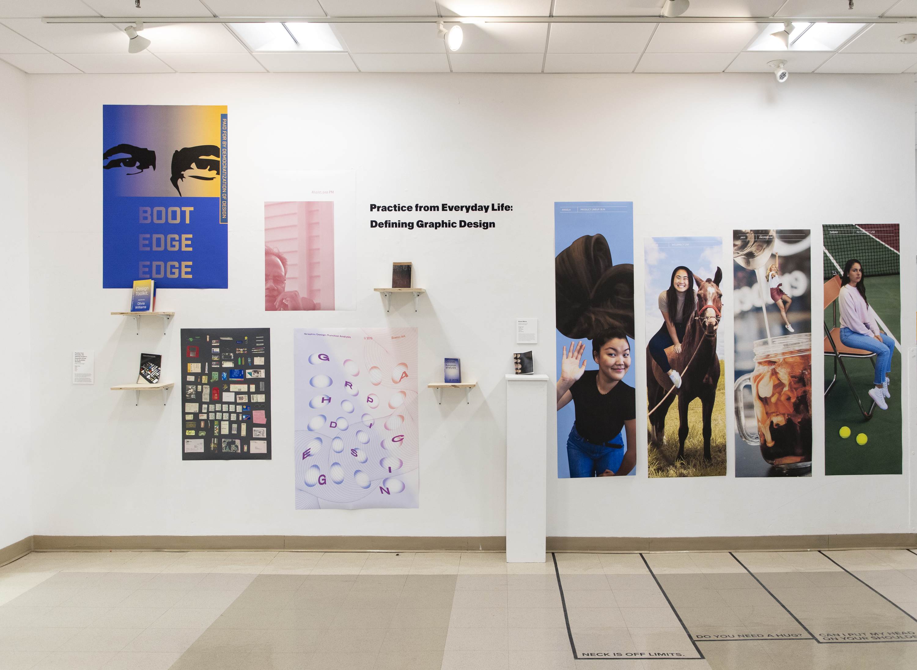
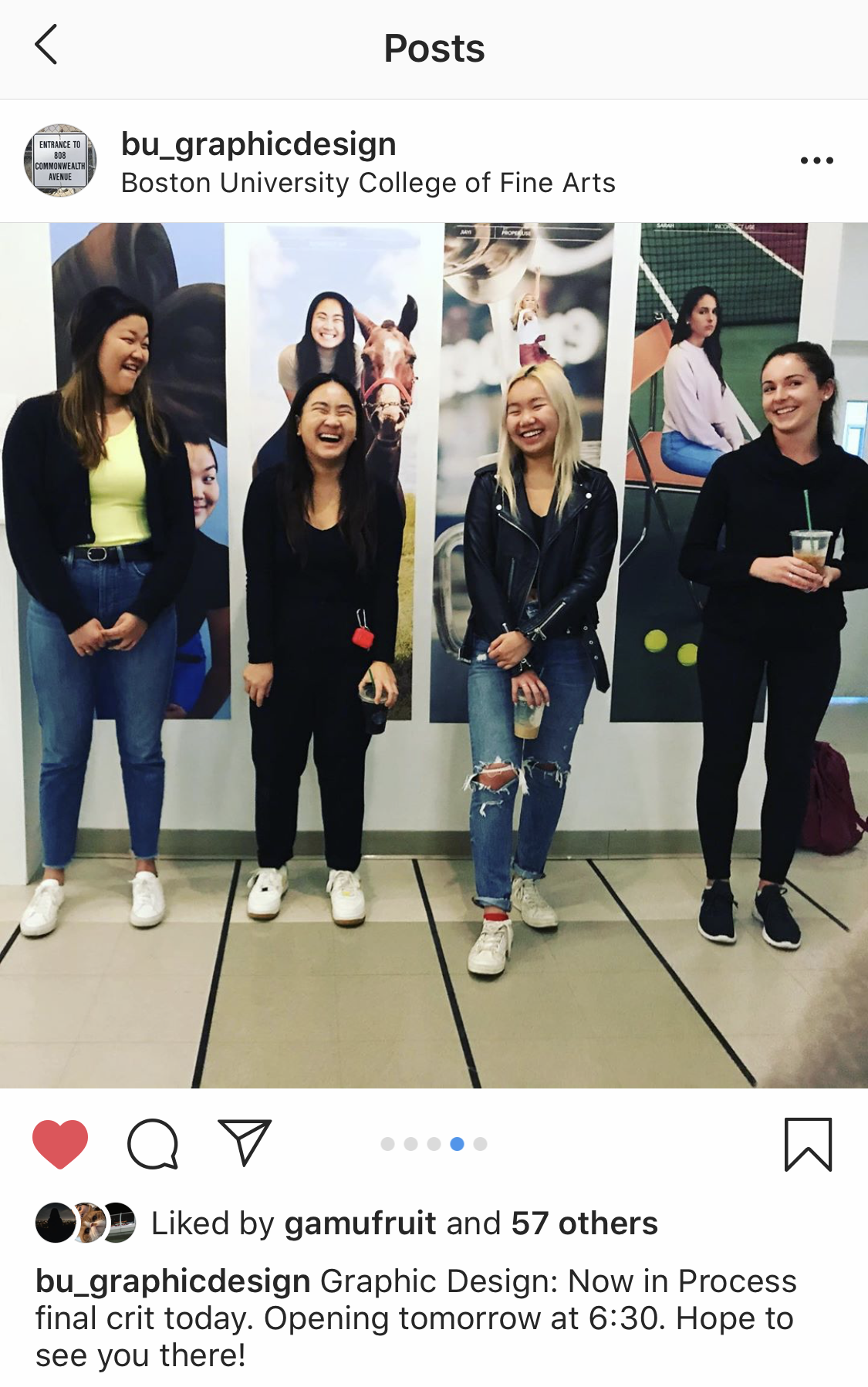
Team:
Angie Wijaya
Jiayi Ma
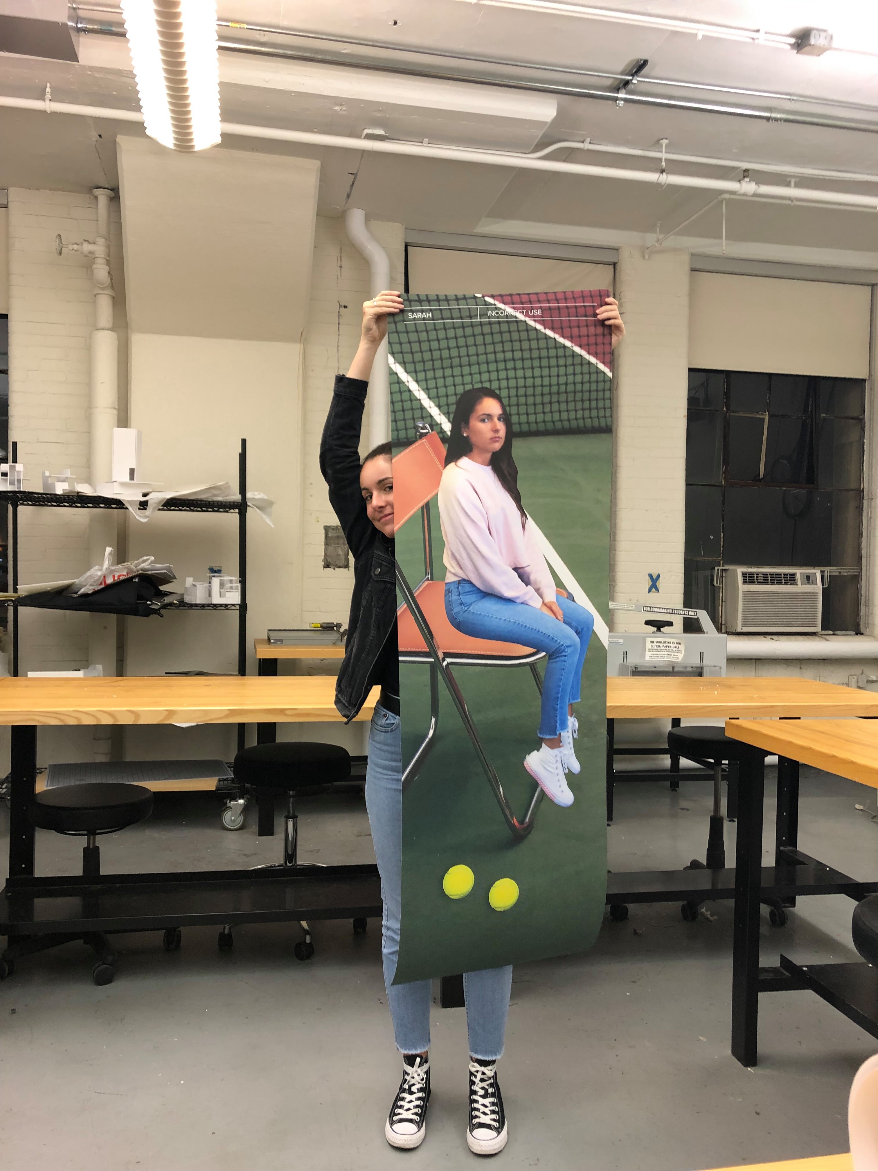
Sarah Perkins
This installation was inspired by Christopher Doyle’s Identity Guidelines in Brand Matrix by Armin Vit and Bryony Gomez-Palacio.
We were drawn to the absurdity of treating a person like a brand and creating a set of guidelines that aligned with our identities.
Our goals were:
To showcase our personalities in a visual system.
To show where we overlapped in the brand matrix.
To show how we are different, and how we are alike.
To use humor and irony to highlight how we came to be today.
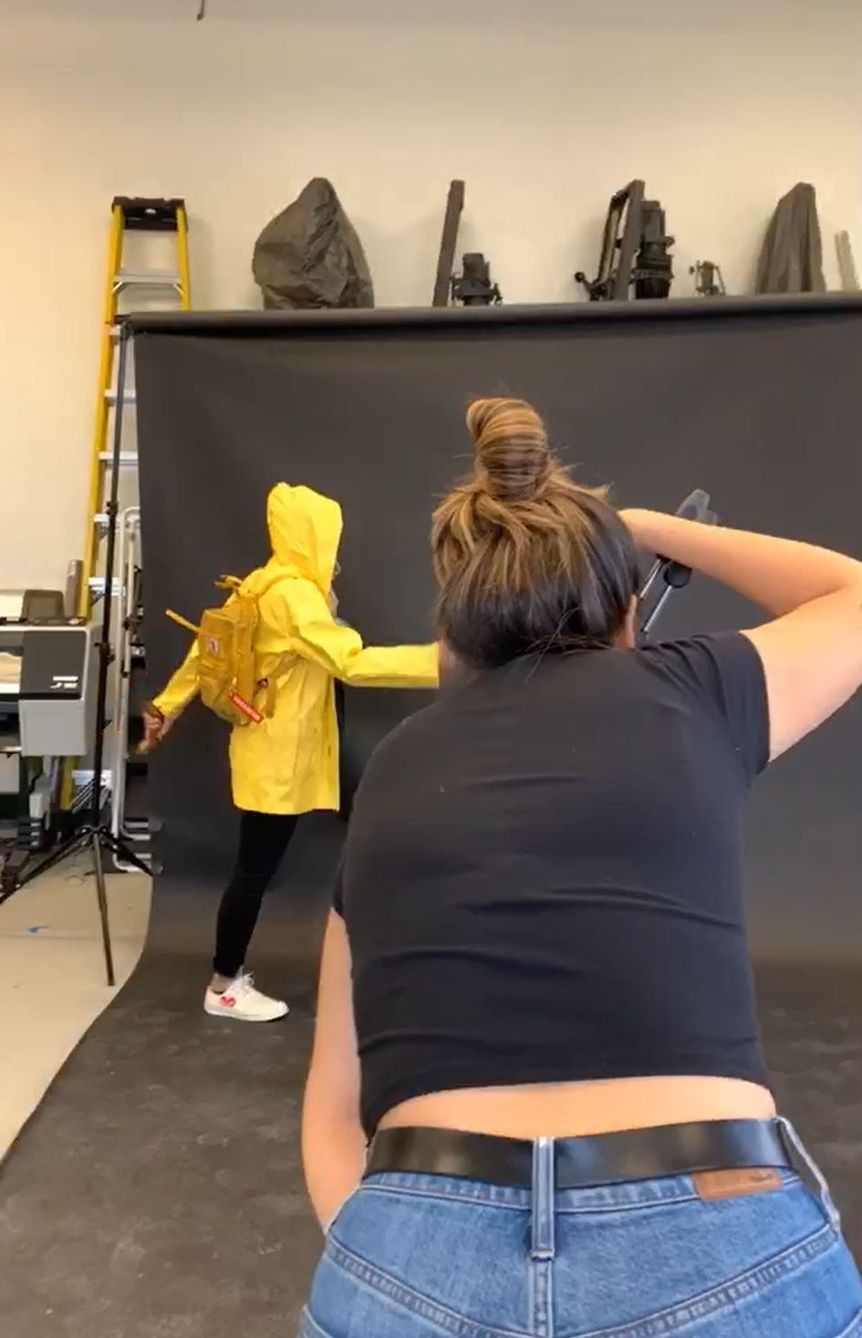
We created a general template and then personalized our own sections including color palette, incorrect use, type systems, patterns, and more.