Boston Public Library
2019

In this project, I rebranded the Boston Public Library. The BPL is a historical landmark in the heart of the city yet their branding doesn’t reflect its significance.
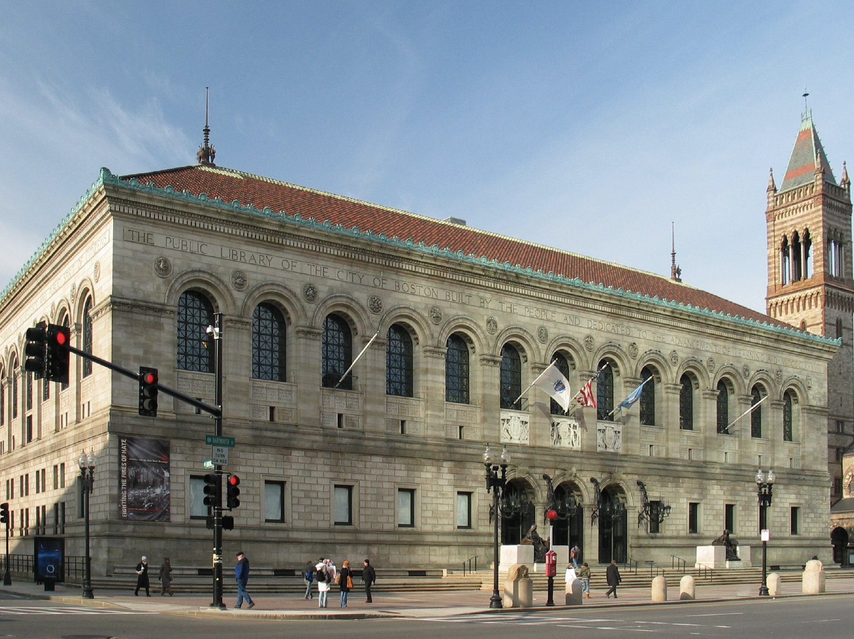
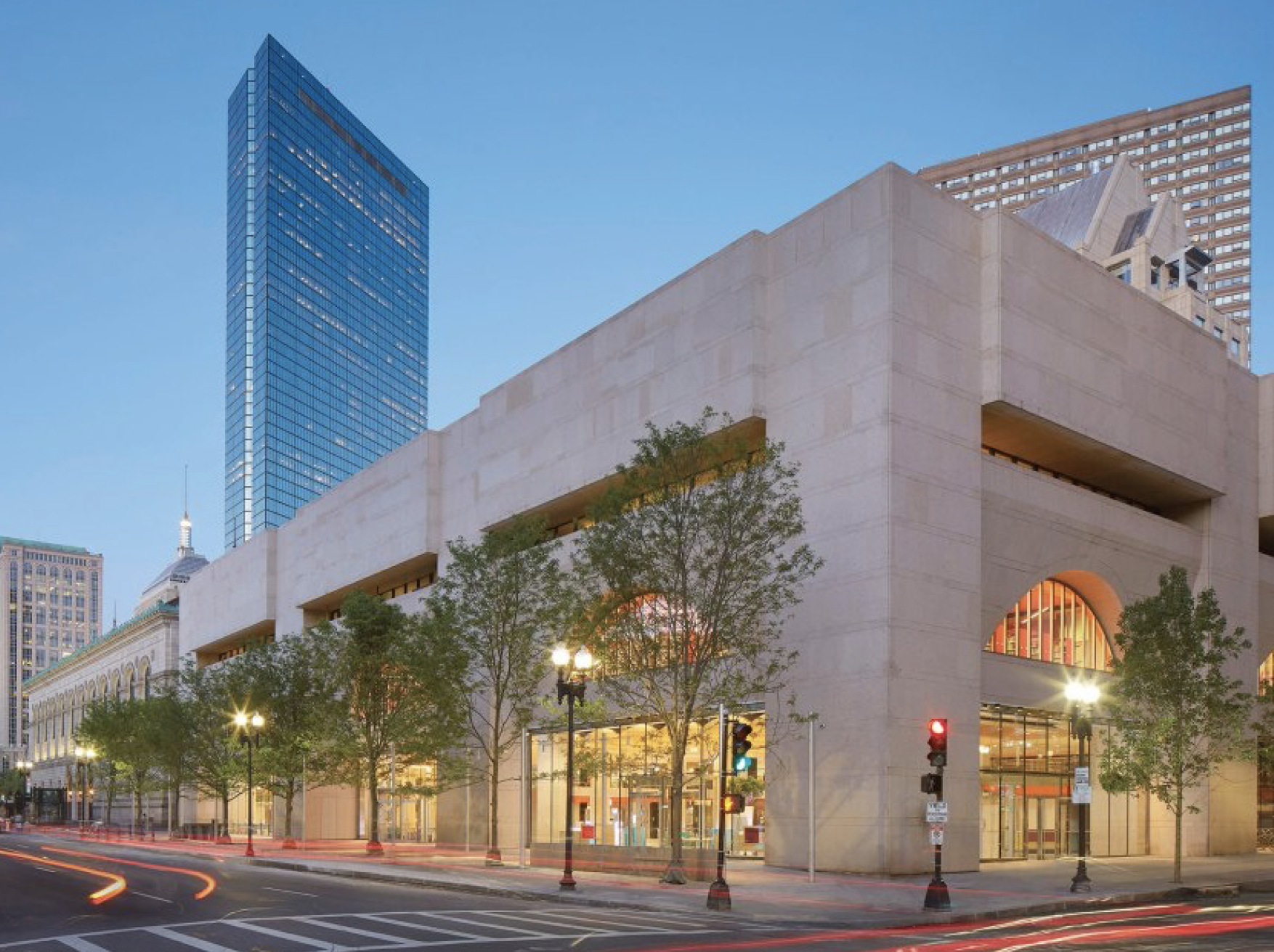
The library has two main buildings: the Johnson Building and the McKim building. I wanted the brand to reflect this duality of the old and new structure.
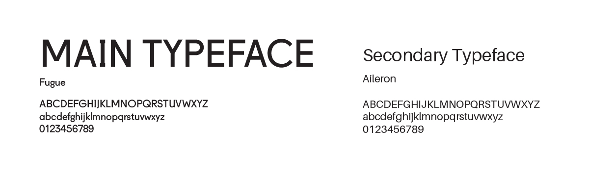
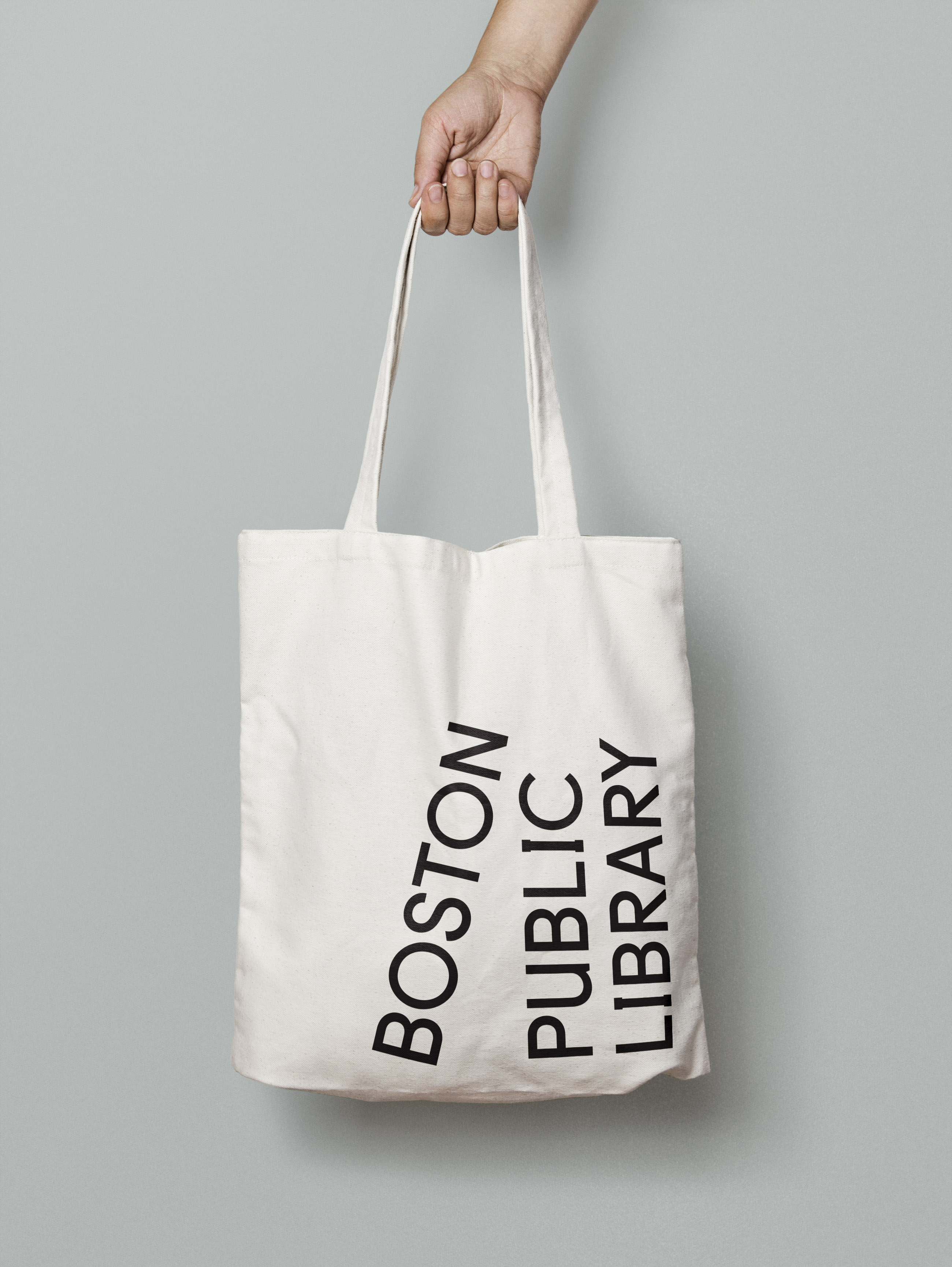
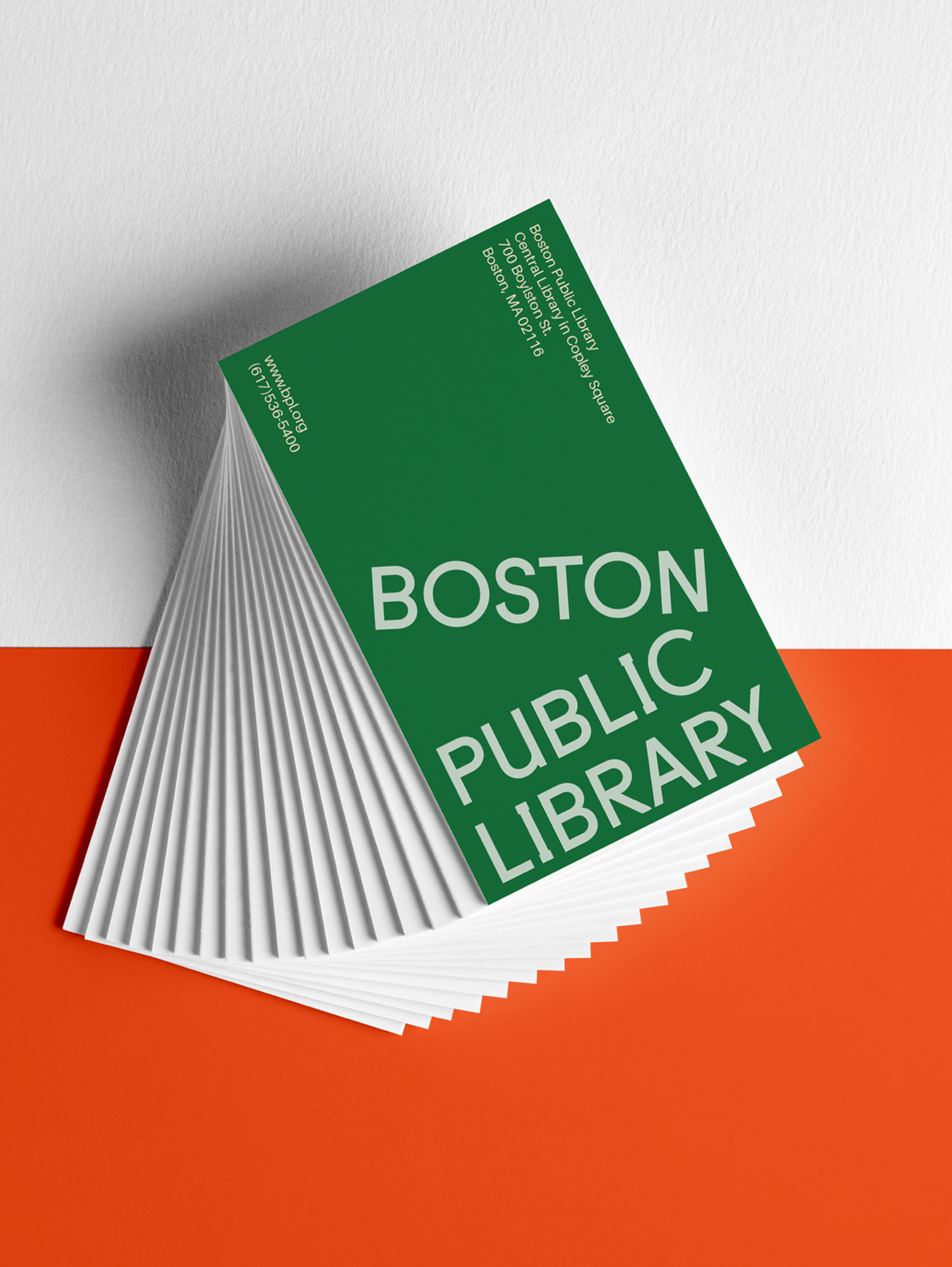
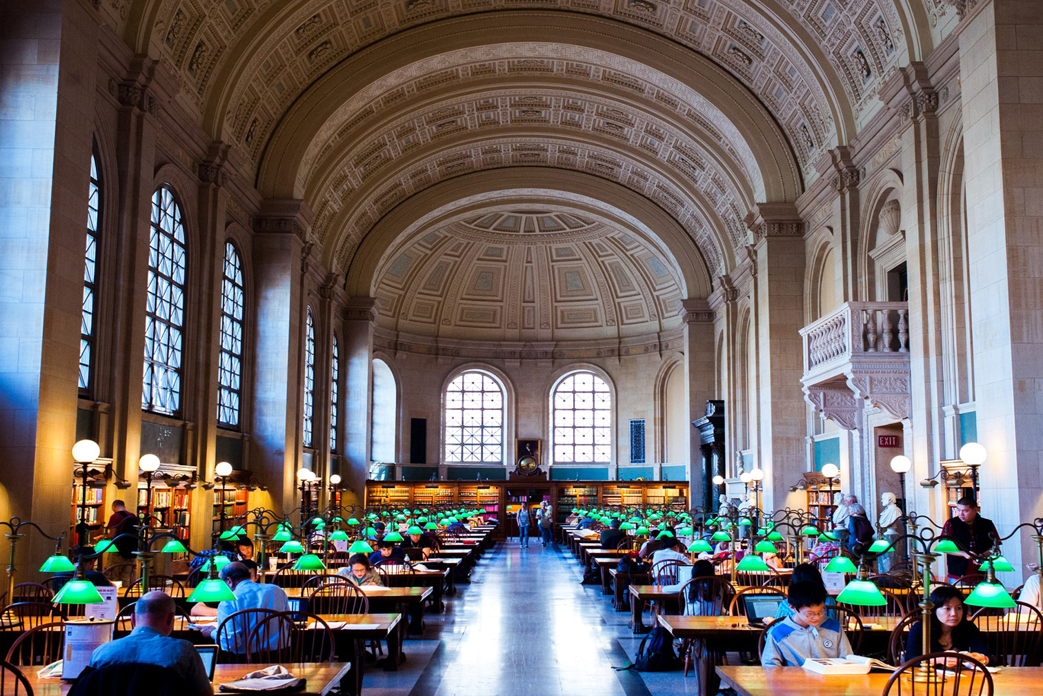
The primary mark has the name turned on its side to reference a stack of books. I’ve chosen a traditional san serif typeface with contemporary quirks. To add a playful element to the brand, I’ve created an alternative mark. In the small space mark, I’ve made a reference to the arches in the structure of both sides of the library and taken this shape into other applications. The color palette is drawn from the famous lamps and garden in the old building as well as the primary bright orange color use in the Johnson building.
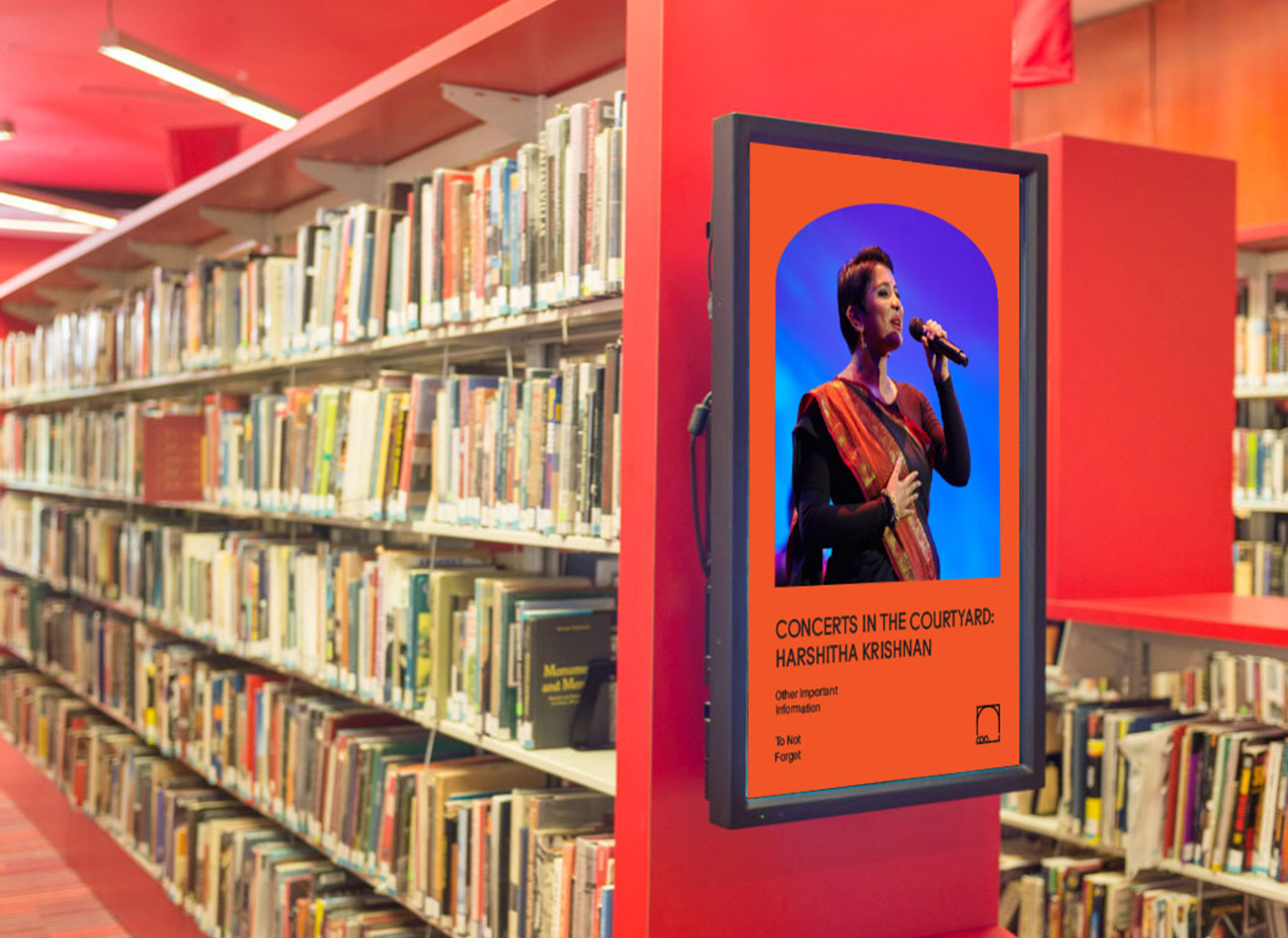
The internal posters will use the small space mark since its in the library. The external posters will give a hint of what you can see inside and inform people that it’s more than just a library.
The library has two main buildings: the Johnson Building and the McKim building. I wanted the brand to reflect this duality of the old and new structure.
The primary mark has the name turned on its side to reference a stack of books. I’ve chosen a traditional san serif typeface with contemporary quirks. To add a playful element to the brand, I’ve created an alternative mark. In the small space mark, I’ve made a reference to the arches in the structure of both sides of the library and taken this shape into other applications. The color palette is drawn from the famous lamps and garden in the old building as well as the primary bright orange color use in the Johnson building.
The internal posters will use the small space mark since its in the library. The external posters will give a hint of what you can see inside and inform people that it’s more than just a library.